

Restaurant Online Ordering Website Design That Sells
A guest has already decided they are hungry. They may be parked outside your restaurant, sitting on the couch after a long day, or planning lunch between meetings. At that moment, restaurant online ordering website design is not simply a digital convenience. It is the path between appetite and a completed order.
When that path feels confusing, slow, or disconnected from the experience guests know and love, even a wonderful menu can lose a sale. When it feels clear, inviting, and easy to use, your website can become a dependable part of your restaurant’s growth – helping regulars return, introducing new guests to your brand, and keeping more of each order within your business.
Your Ordering Website Is Part of the Dining Experience
A restaurant website should carry the same care as the host stand, menu, table setting, or takeout packaging. Guests begin forming an opinion long before they taste the food. A polished online experience tells them that the details matter. A cluttered or outdated one can quietly create doubt, even when the kitchen consistently delivers.
For independent restaurants, cafés, bakeries, and hospitality businesses across Tampa Bay and beyond, this is especially meaningful. You are not trying to look like every national chain. You are giving guests a reason to choose the local place with personality, quality, and a story worth returning to.
That begins with a website that makes your identity visible. Your colors, photography, voice, and menu presentation should create a familiar sense of place. A coastal seafood restaurant may want to feel bright and relaxed. A neighborhood Italian kitchen may lean into warmth, tradition, and generous hospitality. A specialty coffee shop may need an energetic, modern feel that makes its seasonal offerings look irresistible.
The ordering tool should support that atmosphere rather than interrupt it. Guests should feel that they are still with your brand, even when they move from browsing the menu to choosing modifiers and entering payment details.
What Great Restaurant Online Ordering Website Design Does
The best ordering websites make a complex process feel simple. Behind one completed ticket are menus, item variations, modifiers, hours, kitchen workflows, taxes, payment processing, pickup timing, delivery zones, and sometimes third-party platforms. Guests should not have to think about any of that.
They should be able to answer a few easy questions: What sounds good? Can I order it now? Can I customize it? When and where will I receive it?
Make the first choice easy
A guest should see the most useful information quickly: whether you are open, where you are located, how to order, and what kind of food you serve. For restaurants with multiple locations, this may mean prompting visitors to choose a location before they view the menu. For a single-location café, it may mean placing a clear Order Online button in the header and near key menu sections.
The button does not need clever language. Clear wording usually wins. “Order Pickup,” “Start Your Order,” or “Order Delivery” gives guests confidence about what happens next.
A common mistake is asking users to search for the ordering option under several menu tabs, social media icons, or a long block of homepage copy. When someone is ready to order, they should not have to navigate rough waters to find the shore.
Organize menus for hungry people
Your kitchen may use categories that make perfect operational sense, but online guests need categories that help them decide quickly. Keep primary menu groups intuitive, such as breakfast, starters, salads, sandwiches, entrées, desserts, and drinks. If the menu is extensive, use helpful subcategories without making visitors tap through too many screens.
Every item should have a clear name, price, concise description, and an appealing image where practical. Photography is particularly valuable for signature dishes, seasonal specials, catering packages, desserts, and products that may be unfamiliar to first-time guests.
Not every menu item needs a photo. Too many inconsistent images can make a menu feel cluttered or slow. It is often better to invest in a curated set of strong, appetizing images than to fill every listing with rushed photography.
Descriptions deserve attention, too. They should answer the questions that influence a purchase: What is in it? How is it prepared? Is it spicy? Does it include a side? For guests with dietary needs, clear allergen and dietary information supports better decisions. It also reduces avoidable calls, confusion, and disappointment.
Keep modifiers clear and controlled
Customization is where many ordering experiences go off course. Guests appreciate choices, but an endless series of modifier screens can turn a quick meal into a frustrating task.
Build options around what your kitchen can consistently fulfill. Use required choices only when necessary, set sensible limits on add-ons, and write modifier labels in plain language. If a burger includes a choice of side, make that selection obvious. If extra protein carries a charge, show it before the guest reaches checkout.
There is a balance here. A highly flexible menu may increase satisfaction for some customers, but it can also create kitchen errors, slower ticket times, and inconsistent food costs. Thoughtful online ordering design respects both the guest experience and the realities of the line.
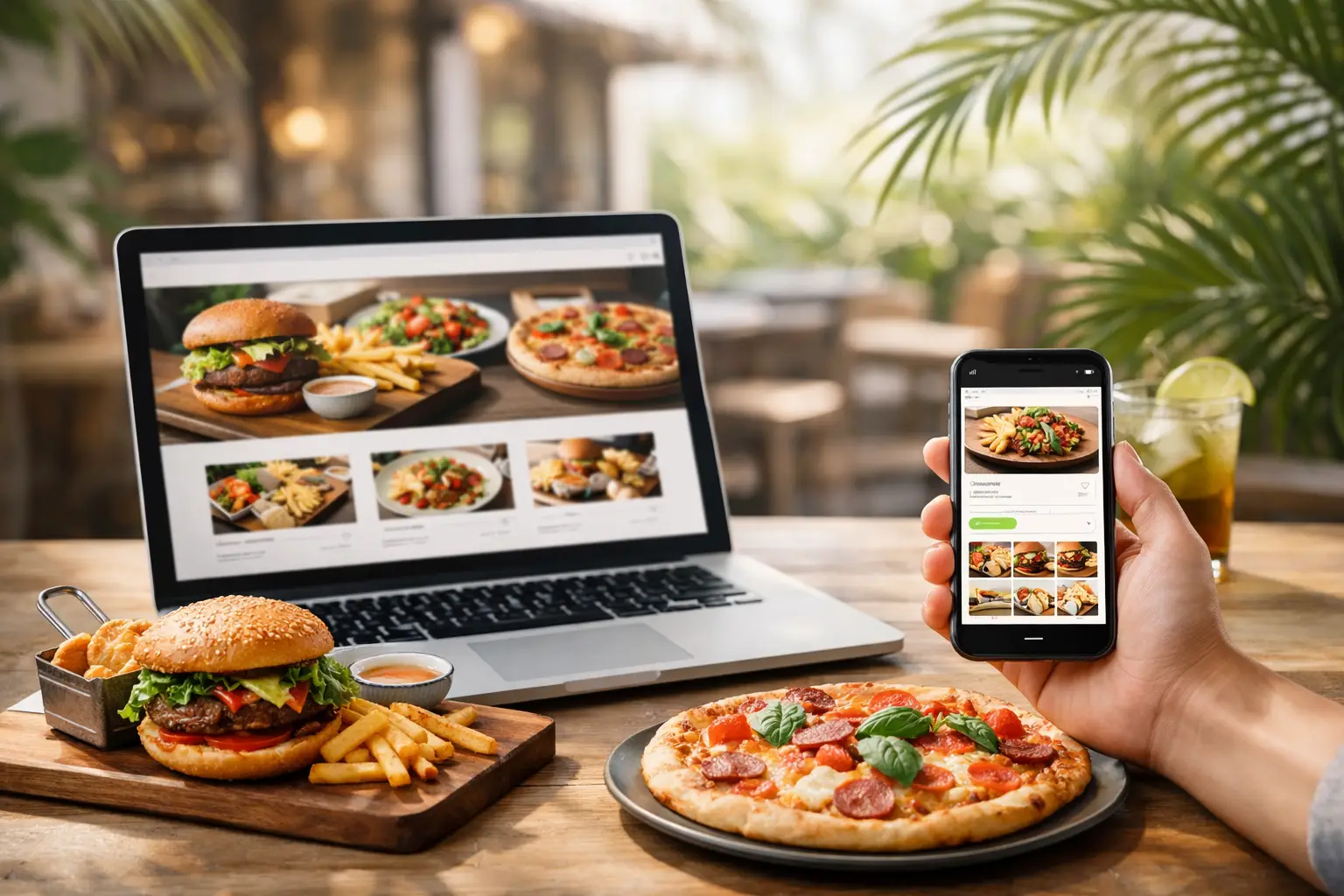
Mobile Design Carries the Most Weight
Many food orders begin on a phone. A guest may find you through a local search, a Google Business Profile, an Instagram post, or a recommendation from a friend. If your site is difficult to use on a small screen, the sale is at risk before the menu has a chance to speak for itself.
Mobile-first design means more than shrinking a desktop website. Buttons should be easy to tap. Text should be readable without zooming. Forms should ask only for necessary information. Important actions, such as viewing the cart or checking out, should remain visible and easy to reach.
Speed matters as well. Large image files, excessive pop-ups, and complicated animations may look impressive in a design review, yet they can slow down an order on a weak mobile connection. A restaurant site can still feel elevated and memorable without making guests wait for it.
Build Trust at Checkout
A guest who has selected their meal is close to converting, but checkout is where hesitation can still surface. The total should be transparent. Fees, tax, tip options, estimated readiness times, and pickup or delivery instructions should be easy to understand before payment is submitted.
For pickup orders, provide useful details such as where to park, which entrance to use, and whether guests should come inside or use curbside service. For delivery, make zones and timing expectations clear. These small details make the handoff feel more thoughtful and reduce strain on your team.
Account creation is another decision that depends on your audience. Returning customers may appreciate saved favorites and faster reordering. First-time guests, however, may abandon a cart if they are forced to create an account before they can pay. Guest checkout is often the more welcoming option, with an invitation to join your email list or loyalty program after the order is complete.
Choose Technology That Fits Your Operations
There is no single best online ordering platform for every restaurant. The right choice depends on your point-of-sale system, staffing, delivery model, menu complexity, budget, and growth plans.
A third-party marketplace can expand reach and introduce your restaurant to new customers. The trade-off is less control over the brand experience, customer data, and fees. Direct ordering through your own website can strengthen margins and build a more direct relationship with guests, but it requires an intentional setup and ongoing attention to menu accuracy.
Some restaurants use both. They keep marketplace profiles active for discovery while encouraging loyal customers to order directly through the website. That approach can work well when messaging, menu pricing, and operations are handled thoughtfully.
Before choosing a system, consider whether it integrates cleanly with your point of sale, supports your modifiers, allows branded ordering, offers reliable reporting, and makes updating hours or sold-out items easy. The most attractive interface is not helpful if staff must manually re-enter orders during a busy Friday night.
Let Your Website Support Local Visibility
A beautiful ordering experience needs to be found. Your website should clearly communicate your restaurant name, location, hours, service area, cuisine, and key offerings. These details help guests and search engines understand what you do and where to find you.
Location pages can be especially useful for restaurants with more than one storefront. Each page should include accurate address information, hours, ordering options, and details unique to that location. Consistency across your website, local listings, and social profiles helps prevent the kind of confusion that sends a hungry guest elsewhere.
Seasonal menus, special events, catering, gift cards, and holiday ordering can also create meaningful opportunities to bring people back to your website. The goal is not to publish content for its own sake. It is to answer real questions and make the next action feel natural.
A restaurant website should feel less like a digital brochure and more like a welcoming front door. With thoughtful design, dependable technology, and a brand experience that reflects the care behind your food, online ordering can become a steady current carrying more guests toward the table – or happily home with dinner in hand.